Mobile SEO Best Practices After Google’s Mobile-First Indexing
- By admin
- Aug 24, 2026

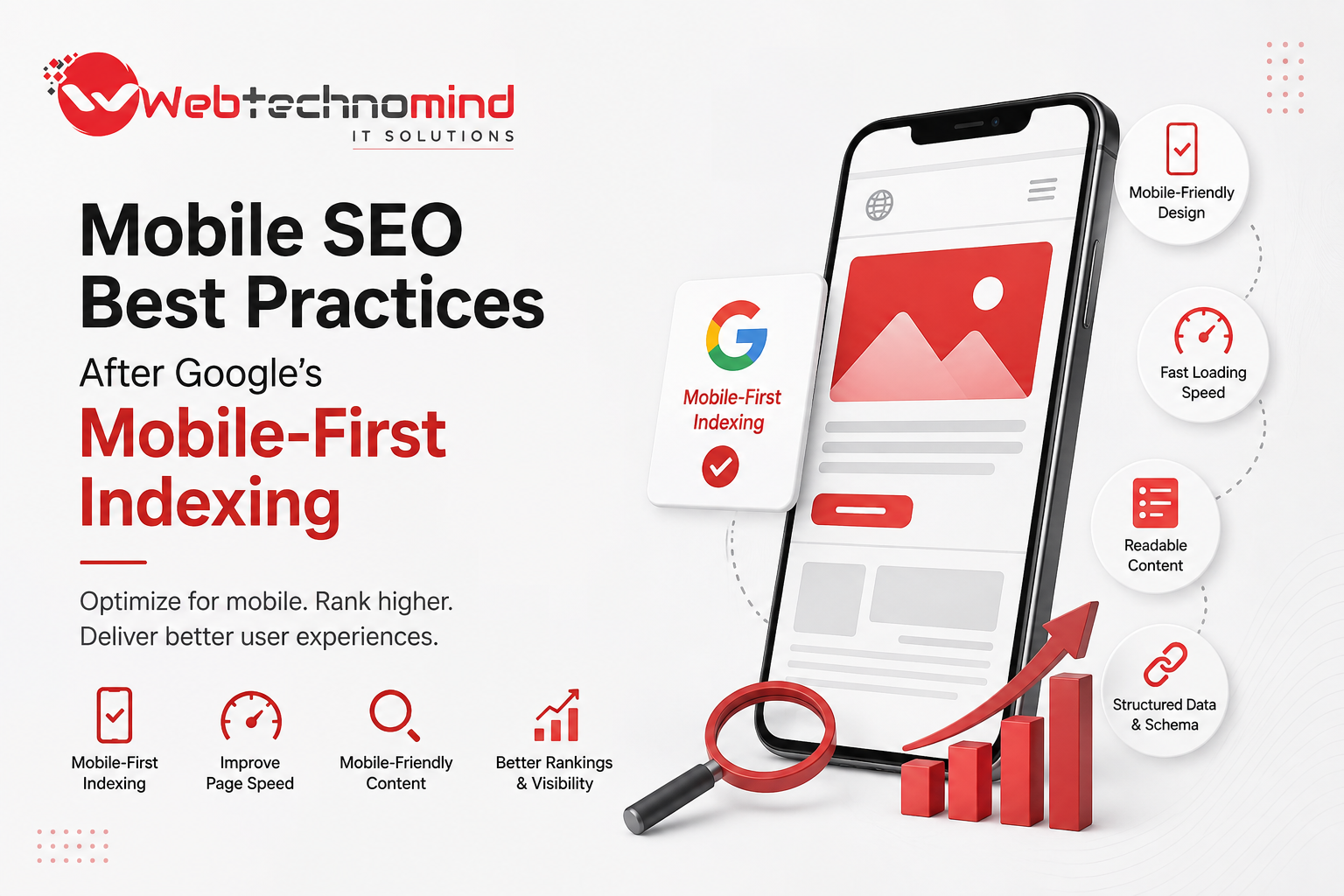







Mobile search has become a core part of how people discover businesses, products, services, and information online. With Google using mobile-first indexing, the mobile version of a website plays a major role in how Google crawls, understands, and evaluates its content.
For website owners and digital marketers, this means mobile SEO is no longer an optional optimization. A website may look excellent on a desktop computer, but if its mobile experience is slow, difficult to navigate, or missing important content, it can negatively affect visibility, engagement, and conversions.
So, what should businesses focus on after Google’s mobile-first indexing? This guide covers the most important mobile SEO best practices to help create a search-friendly, fast, and user-friendly mobile website.
Google’s mobile-first indexing means Google primarily uses the mobile version of a website’s content for indexing and ranking.
In the past, Google’s systems generally evaluated the desktop version first. However, as mobile searches became increasingly important, Google shifted toward using mobile content as the primary version.
Mobile-first indexing does not mean Google has a separate mobile-only ranking system. Instead, it means the mobile version is generally the primary version Google uses to understand a website.
This makes it essential for businesses to ensure that their mobile and desktop websites provide comparable content and functionality.
Mobile users expect websites to load quickly and provide a smooth browsing experience. They are less likely to stay on a page that takes too long to load, contains intrusive elements, or requires excessive scrolling and zooming.
Strong mobile SEO can help businesses:
For local businesses, mobile optimization is particularly important because users frequently search for nearby services, businesses, restaurants, stores, and professionals while using smartphones.
One of the most important mobile SEO best practices is responsive web design.
A responsive website automatically adjusts its layout according to the user’s screen size. Instead of maintaining completely separate desktop and mobile websites, responsive design allows the same page to work across smartphones, tablets, laptops, and desktops.
Make sure:
Responsive design creates a consistent experience while making it easier for search engines to crawl and understand your website.
Page speed is critical for both SEO and user experience.
Mobile users may browse websites using slower connections or older devices, so pages need to load efficiently. A slow website can increase abandonment and reduce conversions.
To improve mobile performance:
Use tools such as Google PageSpeed Insights and Lighthouse to identify performance issues and prioritize improvements.
Core Web Vitals remain an important part of Google’s page experience evaluation.
The key metrics include:
Largest Contentful Paint (LCP): Measures how quickly the main content becomes visible.
Interaction to Next Paint (INP): Measures how responsive a page is to user interactions.
Cumulative Layout Shift (CLS): Measures unexpected movement of page elements while loading.
A good mobile experience requires more than simply having attractive design. Pages should load efficiently, respond quickly, and remain visually stable.
Because Google primarily uses the mobile version for indexing, important content should not disappear from the mobile experience.
Make sure mobile users and search engines can access important:
If valuable content exists only on desktop, search engines may not interpret your website in the same way you expect.
Navigation should be simple and intuitive on smaller screens.
Avoid forcing users to click through multiple complicated menus to find important information. Use clear navigation labels and make interactive elements large enough to tap comfortably.
A well-designed mobile menu should help users quickly reach important pages such as:
Good navigation also improves internal linking and helps search engines discover important pages.
Large images are one of the most common causes of slow mobile websites.
Before uploading images, compress them and select appropriate dimensions. Use modern formats when supported and avoid serving unnecessarily large files to smartphone users.
Also optimize image SEO by using descriptive filenames and meaningful alt text.
For example, instead of:
IMG12345.jpg
use:
mobile-seo-best-practices.jpg
Alt text should accurately describe meaningful images while supporting accessibility.
Mobile search results display titles and descriptions within limited screen space, so your metadata should be concise and compelling.
Your title should clearly communicate the page topic and naturally incorporate the primary keyword where appropriate.
For example:
Mobile SEO Best Practices for Better Google Rankings
A strong meta description should explain what users will gain from visiting the page while encouraging relevant clicks.
Avoid keyword stuffing. Write metadata primarily for humans while keeping search intent in mind.
Mobile SEO is not simply about technical optimization. Content quality remains essential.
Users searching from smartphones often want quick, clear answers. Understand what the searcher is trying to accomplish and structure your content accordingly.
Use:
This makes content easier to scan without sacrificing depth.
Internal links help users discover related information and help search engines understand the structure of your website.
When optimizing for mobile SEO, make sure internal links are easy to identify and tap.
Link relevant pages naturally within your content. For example, a blog about mobile SEO could link to related topics such as technical SEO, page speed optimization, local SEO, and content optimization.
Avoid adding excessive links simply for SEO purposes. Every link should provide genuine value.
Mobile devices are heavily used for local searches.
Businesses targeting a specific geographic market should optimize their website for local search intent.
Include accurate business information such as:
A properly optimized Google Business Profile can also support local visibility.
For businesses with multiple locations, each important location should have useful, unique information rather than duplicated location pages.
Mobile SEO should be part of your overall technical SEO strategy.
Regularly check for:
Use Google Search Console to monitor indexing and search performance and identify technical problems affecting your website.
Pop-ups can be useful for lead generation, newsletter subscriptions, and promotions. However, intrusive interstitials can create a poor mobile experience.
Avoid displaying large pop-ups that immediately cover the main content, especially when users arrive from search results.
If you use pop-ups, make sure they are easy to close and do not prevent visitors from accessing the content they came to read.
A website can appear responsive in a desktop browser while still providing a poor experience on actual smartphones.
Test important pages on different devices and screen sizes.
Check:
Real-device testing can reveal usability problems that automated tools may not fully capture.
Some mobile SEO problems continue to affect websites despite Google’s mobile-first approach.
Avoid:
Fixing these issues can improve both the search experience and the overall user journey.
Before considering your website mobile-ready, verify that:
Google’s mobile-first indexing has changed the way businesses need to approach SEO. The mobile version of your website is no longer simply an alternative experience for smartphone users—it is a critical part of how Google understands and indexes your website.
The best approach is to combine technical SEO, fast performance, responsive design, high-quality content, strong internal linking, and excellent mobile usability.
Mobile SEO should also be treated as an ongoing process rather than a one-time task. Search behavior, devices, technologies, and Google’s systems continue to evolve. Regular performance monitoring and technical audits can help your website stay competitive.
Ultimately, the goal is simple: build a website that is easy for both people and search engines to access, understand, and use on mobile devices. When mobile experience and SEO work together, businesses have a stronger foundation for sustainable organic visibility, engagement, and conversions.
Read More

In today’s competitive digital marketplace, having a website is only the first step towards building a successful online...

In today’s digital-first marketplace, having a website is not enough. Your customers need to find your business when...

Search is changing. People are no longer relying only on traditional Google results to discover businesses, products and...

Search is changing. People no longer rely only on traditional Google results to discover businesses, products, services, and...